
bethere has just reached a milestone: 1.3k users!
Our 1-month old going out network keeps helping more & more users to have great times out with their friends!
of architecture

 Leave a comment

bethere is a facebook based mobile network designed to improve people’s going outs. It lets you have an overview of venues nearby and people planning to bethere shortly or in the next few days.
We like to think that bethere picks up where Facebook’s check-ins leave off.
Leave a comment

The Vaulted Cork Pavillion was built for Amorim Isolamentos Lda., to demonstrate its
cork building materials at Concreta 2013, a biennial building fair held at Exponor,
Porto.
This architecture and research project was developed by Pedro de Azambuja Varela,
Maria João de Oliveira and Emmanuel Novo, who were sponsored by Amorim
Isolamentos Lda. while studying in the Digital Architecture Advanced Studies Course
(CEAAD), a joint venture between ISCTE-IULisboa and FAUPorto. All the fabrication
was carried out at VFABLAB-IUL, and the coordination was carried out by Professors
Alexandra Paio and José Pedro Sousa.
This construction started out as challenge to materialize concepts and investigation
developed within CEAAD 2012/2013, all related with expanded cork agglomerate.
These concepts are: the possibility to span vaults with cork alone, a compound
translucent cork material, and a system for radiation and acoustic optimization. All
these concepts ought to be shown within the pavillion in a symbiotic relation
formalized by the continuous and metamorphic shape.
Architectonic space lies within an inter-relation between inner and outer space,
promoting dynamic fluxes and circulation all around the construction. The outside
provides circulation and rest areas, where people can relax in benches or wavy
forms. The inside is a tunnel like space that has a continuous bench and an
exhibition space, where people can find shelter from the trade fair harsh noise and
lights. All this was formalized as a shape that grows from the floor creating a smooth
transition between the floor and vaulted roof.
Cork characteristics were a main driving force to the space conception. The floor and
walls are smooth and soft, and the smell is very particular. Inside the space one has
the feeling of being inside another environment, such is the effect of changing light,
sound, smell and touch. The grass in the exterior – showing the possibility of using
cork on living roofs – creates a symbiosis of living plants and cork bark.
After a starting phase of brainstorming, an algorithm was created to test different
variations of the form in a parametric level, with many variables responsible for
curvatures and dimensions. Once the shape was agreed upon, another algorithm
was crafted to automatically create the geometry of the hundreds of unique blocks
that were to be CNC cut at the VFABLAB.
All the blocks were labelled with a meaningful system, easing the work of the Amorim
Isolamentos Lda. team while assembling the various pieces.
Tech/Fact Sheet
Name of the project: Vaulted Cork Pavillion
Architecture: Pedro de Azambuja Varela, Maria João de Oliveira and Emmanuel
Novo
Coordination: Alexandra Paio and José Pedro Sousa
Location: Concreta 2013 biennial fair, Porto – Portugal
Main material: Cork
Sponsor: Amorim Isolamentos Lda
Photography: Joao Morgado – Architecture Photography

HISTORICAL CONTEXT
In the second half of the 19th century Portugal saw the return of a large number of emigrants from Brazil. While returning to their northern roots, specially in the Douro and Minho regions, they brought with them sizable fortunes made in trade and industry, born of the economic boom and cultural melting pot of the 19th century Brazil. With them came a culture and cosmopolitanism that was quite unheard of in the Portugal of the eighteen-hundreds.
That combination of Brazilian capital and taste sprinkled the cities of northern Portugal with examples of rich, quality architecture, that was singular in its urban context and frequently informed by the best that was being done in both Europe and Brazil.
BUILT CONTEXT
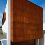
The “Three Cusps Chalet” is a clear example of the Brazilian influence over Portuguese architecture during the 19th century, though it’s also a singular case in this particular context.
Right as the Dom Frei Caetano Brandão Street was opened, a small palace was being built in the corner with the Cathedral’s square and thanks to large amounts of Brazilian money. It boasted high-ceilings, rich frescos, complex stonework, stucco reliefs and exotic timber carpentry. In deference to such noble spaces, the kitchen, laundry, larders and personnel quarters, which were usually hidden away in basements and attics, were now placed within one contiguous building, of spartan, common construction.
Built according to the devised model of an alpine chalet, so popular in 19th century Brazil (with narrow proportions, tall windows, pitched roofs and decorated eaves), the “Three Cusps Chalet” was that one building.
Due to the confluence of such particular circumstances it’s quite likely the only example of a common, spartan, 19th century building of Brazilian ancestry in Portugal.
Siting at the heart of both the Roman and medieval walls of Braga, a stone’s throw away from Braga’s Cathedral (one of the most historically significant of the Iberian Peninsula) this is a particularly sunny building with two fronts, one facing the street at West and another one, facing a delightful, qualified block interior plaza at East, enjoying natural light all day long.
At the time of our survey, its plan is organized by the staircase (brightened by a skylight), placed at the center of the house and defining two spaces of equal size, East and West, on each of the floors.
The nature of each floor changes from public to private as we climb from the store at the street level to a living room (West) and kitchen (East) at the first floor, with the sleeping quarters on top.
Materials-wise, all of the stonework and the peripheral supportive walls are built with local yellow granite, while the floors and roof are executed with wooden beams with hardwood flooring.
ARCHITECTURAL PROJECT
Confronted by both its degrading state and degree of adulteration, and by the interest of its story and typology, the design team took as their mission the recovery the building’s identity, which had been lost in 120 years of small unqualified interventions. The intention was to clarify the building’s spaces and functions while simultaneously making it fit for today’s way of living.
The program asked for the cohabitation of a work studio and a home program. Given the reduced area of the building, the original strategy of hierarchizing spaces by floor was followed. The degree of privacy grows as one climbs the staircase. The stairs also get narrower with each flight of steps, informing the changing nature of the spaces it connects.
A willingness to ensure the utmost transparency throughout the building, allowing light to cross it from front to front and from top to bottom, defined all of the organizational and partitioning strategies resulting in a solution related to a vertical loft.
The design team took advantage of a 1,5 m height difference between the street and the block’s interior plaza to place the working area on the ground level, turing it westward and relating it to the street. Meanwhile, the domestic program relates with the interior plaza and the morning light via a platform that solves the transition between kitchen and exterior. This allows for both spaces to immediately assert quite different personalities and light, even though they are separated by just two flights of stairs.
The staircase geometry, previously closed in 3 of its sides, efficiently filters the visual relations between both programs while still allowing for natural light to seep down from the upper levels and illuminate the working studio.
The second floor was kept for the social program of the house. Refusing the natural tendency for compartmentalizing, the staircase was allowed to define the perimeters of the kitchen and living room, creating an open floor with natural light all day long. Light enters from the kitchen in the morning, from the staircase’s skylight and from the living room in the afternoon.
Climbing the last and narrow flights of stairs we reach the sleeping quarters where the protagonist is the roof, whose structure was kept apparent, though painted white. On the other side of the staircase, which is the organizing element on every floor, there’s a clothing room, backed by a bathroom.
If the visual theme of the house is the white color, methodically repeated on walls, ceilings, carpentry and marble, the clothing room is the surprise at the top of the path towards the private areas of the house. Both the floor and roof structure appear in their natural colors surrounded by closet doors constructed in the same material. It reads as a small wooden box, a counterpoint to the home’s white box and being itself counterpointed by the marble box of the bathroom.
MATERIALS
Fitting with the strategy of maximizing light and the explicitness of the spaces, the material and finish choices used in this project were intentionally limited. White color was used for the walls, ceilings and carpentry due to its spacial qualities and lightness. Wood in its natural color is used for the hardwood floors and clothing room due to its warmth and comfort. Portuguese white Estremoz marble, which covers the ground floor, countertops and on the bathrooms and laundry walls and floors, was chosen for its texture, reflectivity and color.
All of the original wood window frames of the main façade were recovered, the roof was remade with the original Marseille tiles over a pine structure and the decorated eave restored to its original glory.
The hardwood floors were remade with southern yellow pine over the original structure and all the surfaces that required waterproofing covered with Portuguese Estremoz marble.
Ground floor window frames were remade in iron, as per the original, but redesigned in order to maximize natural illumination (as on the east façade).
QUOTATIONS
“Even as we visited it for the first time it became quite apparent what this building was desperately asking for. On one hand, it had to be free from all the gratuitous add-ons that suffocated it and compromised the clarity and logic of its original spaces. And on the other hand (even if it is, in many ways, a symptom of the same malady) to allow light to permeate its spaces. Darkness ended up as the ultimate consequence of the systematic compartmentalization that the building was subjected to. We needed to maximize both transparency and light to allow it to breathe.”
Tiago do Vale
“The building’s original typology, typical of the eight-hundreds -and considering that the building was already designed with flexibility of use in mind- is, in itself, quite permissive and open, fit to answer almost any kind or architectural program.
Being so we never thought of another path besides being faithful to the building’s original nature, as much on its architecture as on its technical solutions and spacial and programatic distribution.
We recovered nor only the original materials but also the original uses of each space. And even when we introduced new materials such as the Estremoz marble, we did it with the criteria of it being right for the building nature and historic context.”
Tiago do Vale
“In this particular case, time wasn’t generous with it [the building].
Sometimes an architect finds himself divided, trying to respond to the challenges of a requalification, seduced between the conceptual honesty of a strict, blind restoration and the conceptually dishonest freedom to lie a little bit about it, to make way for the project to go a bit further on any particular matter.
As always, the best compromise lay in between both extremes, informed by them both: a strict, blind restoration can produce a beautiful and interesting architectural object, but something has to give so that the building is able to respond to the requests of the contemporary way of living. The way we live has changed dramatically over the last 120 years. That response is, in the end, a building’s ultimate mission (and the life it breathes).
When the passing of time is generous, it qualifies and values a building, adding to its original qualities and taking note of it’s path through time. It shows how the way we relate with our homes (the way we live them) steadily changes and evolves, which is enormously enriching and a marvelous architectural experience.
So, returning to this particular case, we tried to commit the tender dishonesty of offering this building a happier story, with a more generous path than the one it actually suffered. We recovered and highlighted its very interesting original characteristics while introducing elements and ideas that could transport, step by step, this home from its foundation times to the present day, perfectly adjusted to the contemporary ways of life.”
Tiago do Vale
“At it most basic, our option was to reclaim the original intent and conditions of the building but with the (fundamental) subtlety of providing an added something beyond a blind restoration. Something that could return the building to a function, to a use (whereby people could inhabit it and live a life of genuine quality), to present day, to the street, to the city, and with enough flexibility to keep it going for an extra 120 years.
This is a delicate matter, though, as function, use, people, streets, cities are all things that relentlessly, unforgivingly, keep changing the way they relate with their built surroundings.”
Tiago do Vale
TECHNICAL SHEET
ARCHITECTURE Tiago do Vale Architects, Portugal
LOCATION Sé, Braga, Portugal
CONSTRUCTION Constantino & Costa
PROJECT YEAR 2012
CONSTRUCTION YEAR 2013
SITE AREA 60 m2
CONSTRUCTION AREA 165 m2
PHOTOGRAPHY João Morgado
bethere is a social network delivering users nice moments by letting them pick the right place and time to go out . have a taste in betheres.com


 info:
info:
 info:
info:
info:
info:


