Archives For entrance

JM_ControlarSistemas_070

check @ Controlar Headquarters by ADOFF.ZURCATNAS

Concept
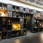
Based on the pre-existence of a large building which serves as a “skin” to maintain, the concept of action is based on dividing the interior space in “boxes” spaced to the existing construction and arranged according to the program and spans in the original facades. This proposal aims to build within the built and add without touching in order to integrate without merging two distinct approaches to architecture, the existing and the new proposal.

Architecture: ADOFF.ZURCATNAS
Location: Alfena, Valongo
Area: 900m2
Year: 2013
Photography credits: Joao Morgado – Architecture Photography

What? – Concept / inspiration
In the current context of globalization, based on a process of technical revolution, the development of companies
in the field of technological innovation, such as Controlar, has been marked by a physical dematerialisation and
smaller requirements in terms of space and scale compared to traditional industry. In this regard, and based on
the pre-existence of a large building which serves as a “skin” to maintain, the concept of action is based on
dividing the interior space in “boxes” spaced to the existing construction and arranged according to the program
and spans in the original facades. This proposal aims to build within the built and add without touching in order to
integrate without merging two distinct approaches to architecture, the existing and the new proposal.
Why? – Choices / motivation
The choice of partition of the space and the space between “boxes” and to the “skin” allows the profusion of
natural light from the roof and facade into the interior of the nave of the building, allowing illumination of traffic,
leisure and working areas. This objective of sustainability has also generated concern about the issue of cooling,
which is restrained to the interior of the rooms, restricting the consumption needs to each of the spaces. In this
concept of organization through independent “boxes” it is built up an “outdoor space” within the interior of the
building, in a logic of gradual dissipation of accessibility, in which the entire infrastructure network is developed so
that access for maintenance and change is facilitated.

How? – Materials / products

In order to stand out the “boxes” from the “skin” the whole building was standardized through the use of grey
colour, contrasting with the white used in new construction in which the application of materials from the industrial
imaginary, such as polycarbonate and metal, assumes a finishing language with the reinterpretation of their
natural characteristics in order to achieve a bright space and of easy maintenance due to their reflective and
plane surfaces. This concept of sharing space through the use of “boxes” allows its implementation through the
reproduction of economic light structures with the development of typified construction details targeting
rationalization of construction.

idA . single-family house on Schuetzengasse . Oberlunkhofen (5)

check @ | Single-family house on Schuetzengasse by ldA

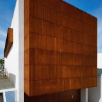
The new single-family house on Schuetzengasse in Oberlunkhofen, Aargau, Switzerland is composed from two entwined volumes. Open floor plans connect multiple levels.The higher volume in the back, which contains the main functions, is completed with a base volume up front. It includes secondary functions like the garage and forms at the same time a generous terrace for the house.

AFF architekten . Elf Freunde . Berlin (1)

check @  | Elf Freunde by AFF architekten

5_Low_CHAPEAU MULTIBRAND STORE 2012_-Copyright.-2012.-Mayte-Piera

check | CHAPEAU multibrand store by RAMON ESTEVE ESTUDIO

CHAPEAU
The new reference multibrand store is designed by the architect Ramón Esteve. At the store we
can find man and woman fashion in a 800 square meter surface.
With 25 years of experience, Chapeau has placed as a showcase for luxury and fashion trends in
Spain.
This new space is located in 5, Hernán Cortés Street of Valencia. Men and women fashion coexist
in an architectural space designed with a set of mirrors and prisms in which the garments are the
leading character. Divided along its lenght by a line of white mirror changing rooms, the space
culminates in a huge skylight that rises over a black glass wall making the journey an authentic
visual experience.
In this matter brands like Prada, Marni, Gucci, Stella McCartney, Alexander Wang, Balmain, Saint
Laurent, Lanvin and Miu Miu for women are placed the right wing of the store, while other brands
like Tom Ford, Thom Browne, Prada, Moncler, Balmain, Neil Barret or Band of Outsiders are arranged
at the left wing dedicated to men.
Taking on account this new space, Chapeau group has a total of three stores located in the busiest
commercial environment of the city. In the same street, Chapeau 3 (16, Hernán Cortés Street)
is dedicated to a younger fashion and Chapeau Shoe in (39, Cirilo Amoros Street for women accessories.
Based on the philosophy of excellence in all its stores, the key for their success has always been
the expert choice of clothes. Since the owners Pilar Puchades and Jose Tamarit launched the first
shop in 1987 Chapeau has had the best collections of the showrooms of Paris, Milan and New

York. Its capacity for prescribing has built loyalty in a significant number of clients from all over
Spain. “Our client is an elegant woman who dresses simply. Not a woman of a season,” explains
José Tamarit. Today Chapeau is among one of the top multibrand stores of Spain. “Stores have to
renovate, not only the product but also the spaces.”
ARCHITECTURE OF SPACE
A large black steel marquee is illuminated through openings, it is the frame for the glass facade of
the store, presenting separate entrances for men and women as scenes for showing the collections.
The shop winfdow is usually characterized by the space where mannequins are, in this case
is breaking natural barriers and visual boundaries having the entire shop as background.
Inside the store you pass through a sequence of scenes beginning with the access, dominated by
two large LED screens with video art compositions produced by Javier Santaella for Chapeau. The
next scene is defined by long pieces that emerge from the walls where you find the stone voulme
counters emerging from the ground connecting spaces between male and female areas. Reaching
the changing rooms the areas are visually separate again. At the end the space is joined
again in a high background topped by a skylight that floods with natural light the interior of the
store.
This progression of spaces organizes the store in areas that highlight the identity of the collections
in order to give appropriate value to each brand exposed.
The project is defined by pure geometry which is represented by three basic categories. On one
hand, sets of prisms materialized through various items such as boxes of reflecting mirrors in the
center. This prims are used as changing rooms. In the other hand white light volumes on the perimeter
and large vertical black mirror at the higher space.

VALENCIA, SPAIN

The next category is about the planes that form the ceilings and skylight. A succession of inclined
planes along a longitudinal path can accommodate facilities without losing height. These planes
lead to the end of the shop, where they transform into angled glass sheets that close the skylight
on a horizontal plane.
The most basic category corresponds to the lines formed by the clothes hangers and the fine pieces
of furniture where clothes rest and hang. This element is also found in the openings that invade
the whole space, breaking planes and generating edges.
The formal language defined by the basic geometries of solid, plane and line, materializes with
glass, mirrors, stones and metals in white, gray and black tones to achieve the ideal atmosphere
for exhibiting the highest quality product in an attractive play of reflections, shades and lights.
THE ARCHITECT
Ramon Esteve is a former Architect since 1990 by Escuela Tecnica Superior de Arquitectura de
Madrid
Harmony, serenity and essentiality are some of the constants showed in his work; this is an intention
of contribution to the environment, leaving more than buildings. The consequence of this is the
generation of embracing environments creating unique experiences.
All the energy is orientated in every work to the same direction, in the look for the excellence as a
daily habit, constantly and continuous.
Among the works, developed during his 20 years experience, we can find different kind of projects
in scale and use but they have in common the same intensity.
The portfolio includes wide expertise in public building, as sanitary, educational and cultural. Also
includes Private buildings of public use; as banks, offices, hotels, entertainment, restaurants, retail
and ephemeral Architecture. It is worth to mention single detached houses where we can see his
philosophy shown as his own dimension.

PRESS
Lucía Jiménez
Marketing & Communication Dpto.

Tel: +34 963 519 434 ext. 25

Pöt by Gerner Gerner Plus 2

check @ domusweb | Pöt by Gerner Gerner Plus


The knuckle house by Indez architecture 3

check @ frameweb | The Knuckle House by Index Architecture

House K by Yamauchi architects 5

House K by Yamauchi architects

Casa NP by NoArq

check frameweb | Casa NP by NoArq

Folm Arts beauty salon by Tsubasa Iwahashi Architects

check @ dezeen Folm Arts beauty salon by Tsubasa Iwahashi Architects

Cassell Street House by b.e architecture 6

check homedsgn | Cassell Street House by b.e architecture


Torus by N MAEDA ATELIER 2

check plataformaarquitectura | Torus by N MAEDA ATELIER

House in Konan by Coo Planning

check archdaily | House in Konan by Coo Planning


Ses Alzines by Javier Mantolán Seguí 4

check @ | Ses Alzines by Javier Mantolán Seguí


Steel House by Fuminori Nousaku Architects

check @  | Steel House by Fuminori Nousaku Architects

Antonio Solá Apartments by DCPP arquitectos 12

check architizer Antonio Solá Apartments by DCPP arquitectos